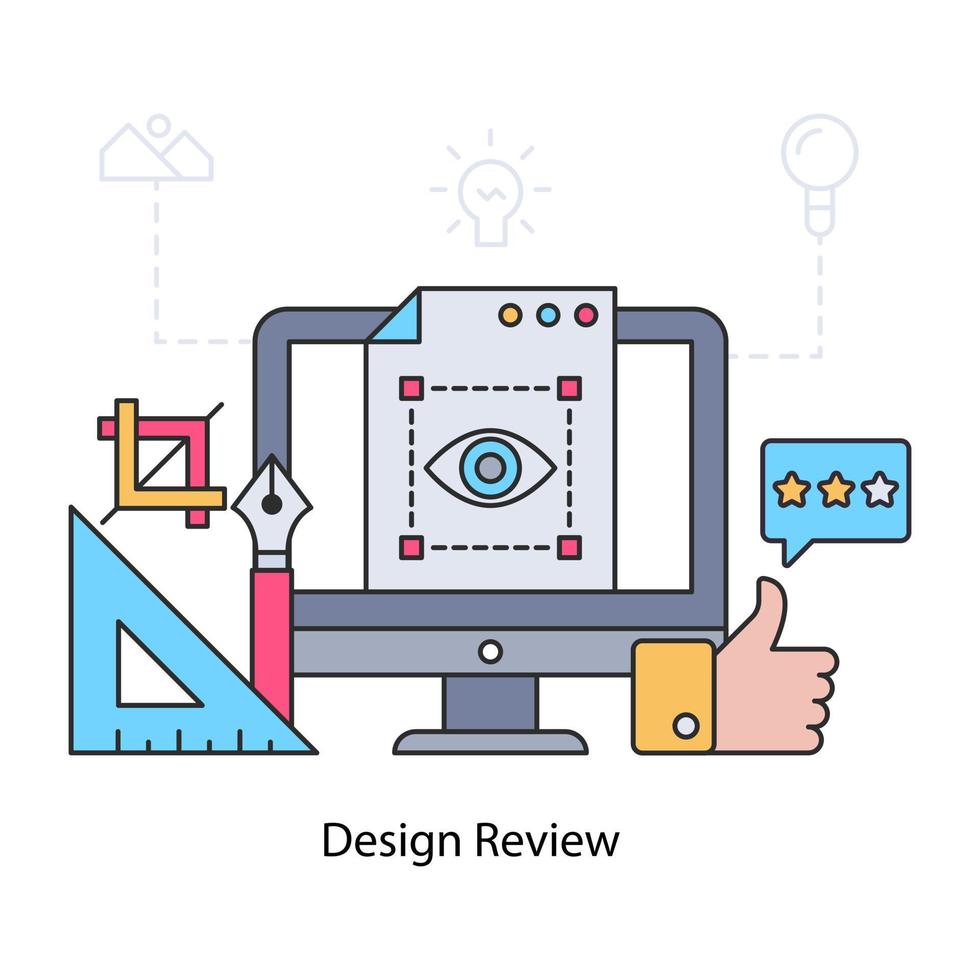
Design Review
Design Review Service of Accessible Minds
At Accessible Minds, our team does a thorough review to bring out the attention to different visual elements that include in design; for example, positioning, color contrast, etc. These elements, if not properly placed, can hinder digital access for people with visual impairments. We can say that, the colors red and green cannot be placed together because people with dichromatic vision would not be able to see one of the colors.
This applies to the use of fonts, font size and special characters as well. One needs to use the font and characters in their digital products that can be read by screen readers because most of the screen reading software do not read special characters as font and it disrupts the users understanding of the content.
The expert team members of Accessible Minds who are also accessible technology users, have a thorough understanding of these aspects. They identify and highlight issues with your design and make sure your digital products’ user experience is equally convenient for all users, with disabilities or otherwise.
FAQ'S
An "Accessibility Design Review" service involves a comprehensive evaluation of digital products, websites or applications to assess their compliance with accessibility standards and guidelines. This review aims to identify potential barriers that might hinder access for individuals with disabilities; providing valuable insights for improving the overall accessibility of the design.
"Design Review for Accessibility" is a thorough examination of the design elements and user interface components of a digital product to ensure they meet accessibility requirements. The review encompasses aspects like color contrast, font sizes, interactive elements, keyboard navigation and other visual elements to guarantee that individuals with disabilities can access and navigate the content effectively.
The "Accessibility Visual Elements Review" concentrates on evaluating the visual aspects of a digital product's user interface for accessibility. This review assesses elements such as icons, images, graphics and other visual cues to ensure they are perceivable and understandable to all users; including those with visual impairments.
An Accessibility Design Review offers several benefits. Firstly, it helps ensure that your digital product is inclusive and accessible to a broader audience, potentially increasing user engagement and satisfaction. Additionally, it demonstrates your commitment to accessibility, which is increasingly important for legal compliance and public perception. Lastly, addressing accessibility issues early in the design process can save time and resources in future development stages.
While the recommendations from a Design Review for Accessibility are not mandatory; they are highly valuable for achieving inclusive design and meeting accessibility standards. Following these recommendations demonstrates a commitment to accessibility and ensures that your digital product provides an equal user experience for everyone. Moreover, adhering to accessibility guidelines can help your organization avoid potential legal issues related to accessibility compliance.
FAQ'S
An "Accessibility Design Review" service involves a comprehensive evaluation of digital products, websites, or applications to assess their compliance with accessibility standards and guidelines. This review aims to identify potential barriers that might hinder access for individuals with disabilities, providing valuable insights for improving the overall accessibility of the design. Integrating Digital Accessibility Testing Services ensures a thorough examination, enhancing the effectiveness of the review process.
"Design Review for Accessibility" is a thorough examination of the design elements and user interface components of a digital product to ensure they meet accessibility requirements. The review encompasses aspects like color contrast, font sizes, interactive elements, keyboard navigation, and other visual elements to guarantee that individuals with disabilities can access and navigate the content effectively. Incorporating Digital Accessibility Testing Services into this process enhances the precision of the assessment.
The "Accessibility Visual Elements Review" concentrates on evaluating the visual aspects of a digital product's user interface for accessibility. This review assesses elements such as icons, images, graphics, and other visual cues to ensure they are perceivable and understandable to all users, including those with visual impairments. Employing Digital Accessibility Testing Services enhances the accuracy of evaluating visual elements for comprehensive accessibility.
An Accessibility Design Review offers several benefits. Firstly, it helps ensure that your digital product is inclusive and accessible to a broader audience, potentially increasing user engagement and satisfaction. Additionally, it demonstrates your commitment to accessibility, which is increasingly important for legal compliance and public perception. By incorporating Digital Accessibility Testing Services, you ensure a more robust review process, addressing potential issues thoroughly.
While the recommendations from a Design Review for Accessibility are not mandatory, they are highly valuable for achieving inclusive design and meeting accessibility standards. Following these recommendations demonstrates a commitment to accessibility and ensures that your digital product provides an equal user experience for everyone. Moreover, adhering to accessibility guidelines, reinforced by Digital Accessibility Testing Services, can help your organization avoid potential legal issues related to accessibility compliance.